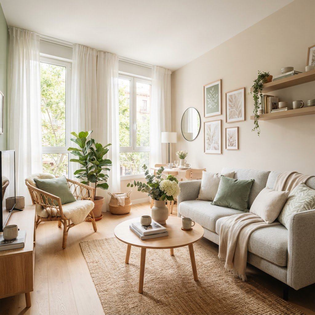
Living in a compact area often feels like a puzzle where every square inch matters. When you are looking to maximize your home, the interplay between paint color and lighting becomes the most powerful tool in your design arsenal. Rather than feeling confined by your floor plan, you can use strategic design choices to manipulate perception and create an atmosphere that feels airy, open, and intentional. Mastering this balance is the secret to elevating any small apartment from a functional unit to a stylish personal retreat.
Understanding the Impact of Light and Tone
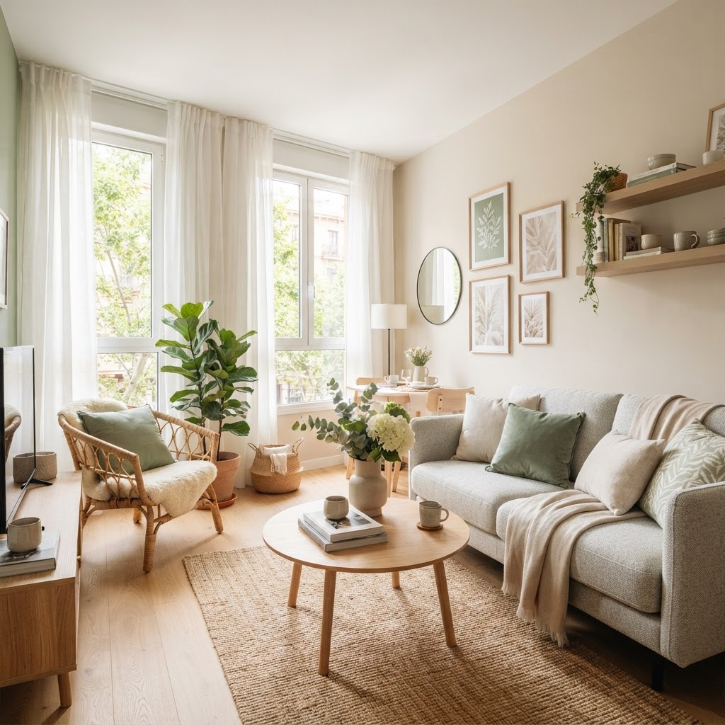
The fundamental goal in any limited footprint is to manipulate depth and height. Color and light are not merely decorative elements; they are architectural tools. Dark colors tend to absorb light, which can make walls feel like they are closing in on you, while lighter tones reflect light, effectively pushing boundaries outward. By carefully selecting your palette and layering your sources of illumination, you can control the mood and scale of your environment.
The Science of Reflectivity
When light hits a surface, the color of that surface dictates how much of that light bounces back into your living rooms. High-reflectance colors like soft whites, pale creams, and light pastels act as mirrors for natural light. If you rely on artificial sources, pairing high-gloss or satin finishes with these colors will further amplify the glow, helping to soften corners that might otherwise feel shadowy.
What is the Best Color Scheme for a Small Apartment?
Choosing the right palette is the first step toward visual expansion. Many designers gravitate toward monochromatic schemes because they remove the “visual noise” of multiple contrasting colors. When your walls, trim, and large furniture pieces share a similar tonal range, the eye travels across the space without interruption, creating a seamless flow that tricks the brain into perceiving more square footage.
The Power of Neutrals
Soft greige, warm taupe, and crisp white remain the gold standards for a reason. These shades provide a neutral backdrop that makes art and textures pop without overwhelming the senses. If you fear a white room will look sterile, introduce warmth through natural wood tones, woven baskets, and linen textiles to add depth and personality.
How to Brighten Up a Small Apartment?
To effectively brighten a small apartment, you must address both your paint selection and your hardware choices. Start by removing heavy window treatments that block natural rays. Instead, opt for sheer curtains or roman shades that allow light to filter through. Combine this with mirrors strategically placed opposite windows to bounce light into the darker reaches of the floor plan.
Layering Your Lighting
Never rely solely on a single overhead “boob light.” Lighting design requires three layers: ambient, task, and accent. Use floor lamps in corners to push light upward, wall sconces to save floor space, and under-cabinet lighting in kitchens to eliminate dark shadows. This multi-layered approach ensures that every inch of your home feels intentional and visible.
Understanding the 3 Color Rule in Interior Design
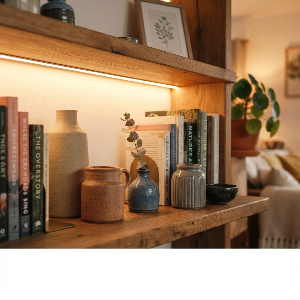
If you love color but worry about clutter, you should adopt the 60-30-10 rule. This strategy suggests that 60% of your room should be a dominant neutral, 30% should be a secondary color, and 10% should be a bold accent. This prevents the room from feeling chaotic and ensures that your chosen shades work in harmony rather than competing for dominance.
Executing the Ratio
In a small space, the 60% neutral should ideally be on your walls. The 30% secondary color can be integrated through an area rug or a set of curtains. Finally, the 10% accent is reserved for throw pillows, ceramics, or artwork. By keeping these elements balanced, you maintain a sense of calm while still injecting personality into your home.
What Color is Replacing Gray in 2026?
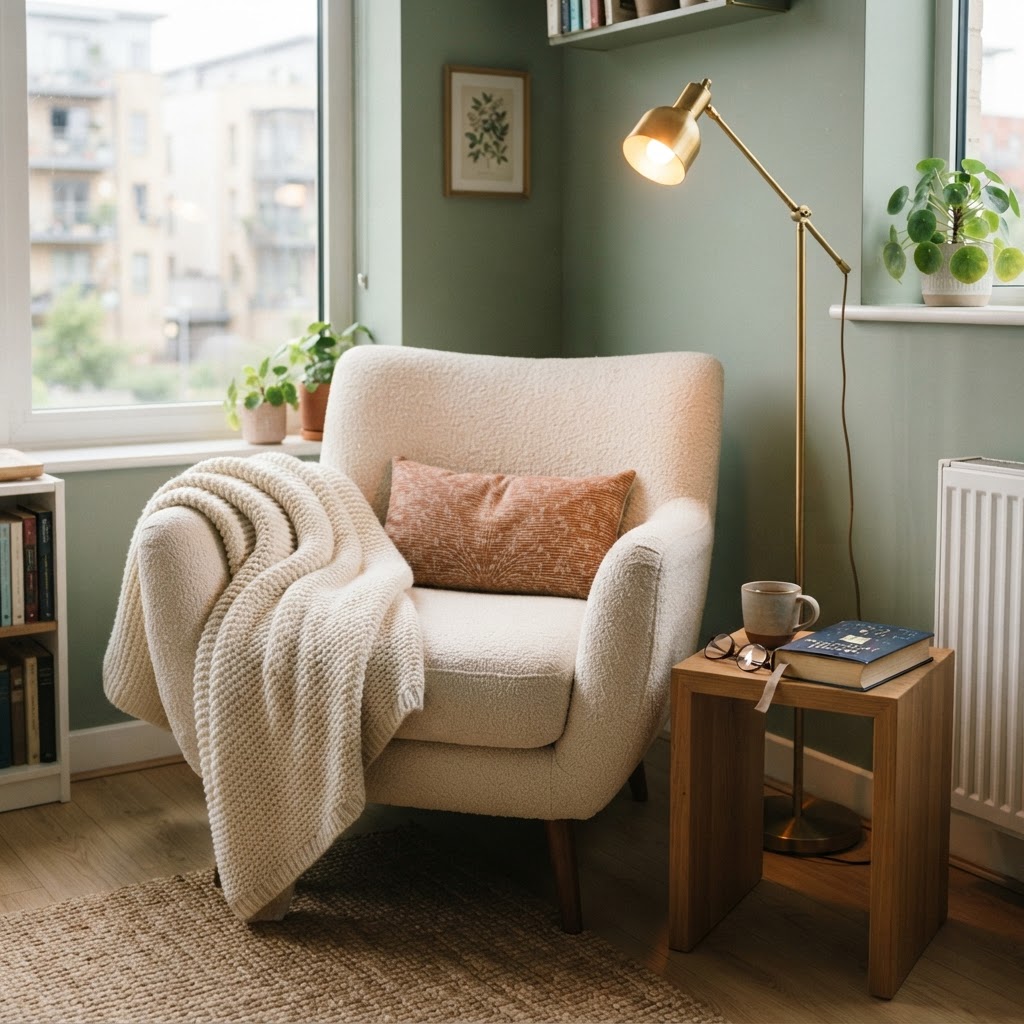
As interior trends shift, designers are moving away from the stark, cool grays that dominated the last decade. In 2026, the trend is shifting toward “warm earth tones” and “nature-inspired hues.” Specifically, soft sage greens, buttery yellows, and terracotta-infused neutrals are becoming the new favorites. These colors provide the same versatility as gray but add a layer of organic warmth that makes an apartment feel like a sanctuary.
Testing Your Palette
Before you commit to a full paint job, always buy samples. Paint a two-foot-by-two-foot square on different walls and observe how the color changes from morning to night. Light behaves differently in a small space depending on your orientation—north-facing rooms often have cooler light, while south-facing rooms get warmer tones.
Creating Visual Continuity in a Small Space
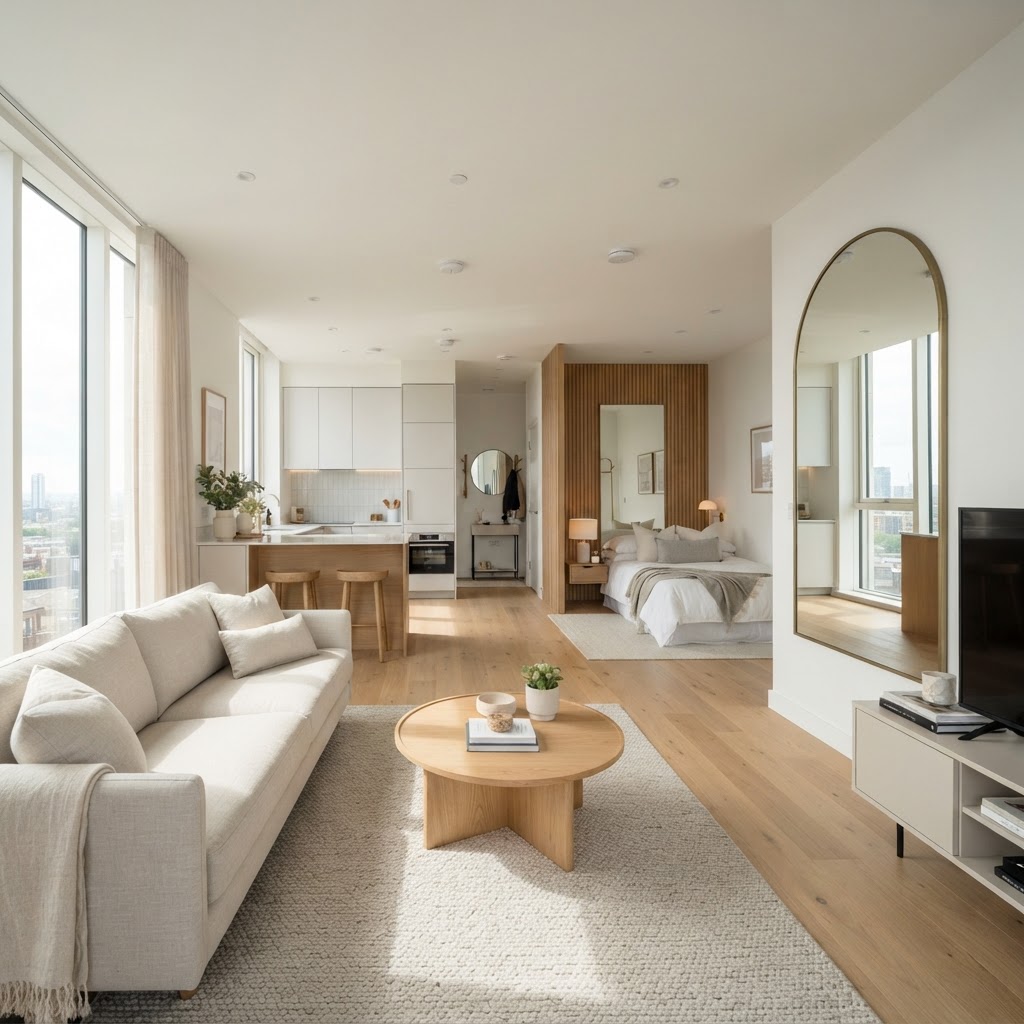
Consistency is the hallmark of a well-designed interior. If your apartment has an open floor plan, try to use the same color palette across the entire area. Transitioning between colors creates “choppiness,” which makes the footprint appear smaller. By carrying the same wall color through your living and dining areas, you create a cohesive “envelope” that feels expansive.
Mirrors as Architectural Elements
Mirrors are more than just reflective surfaces; they are essential tools for adding depth. A floor-to-ceiling mirror in a hallway can double the perceived width of the corridor, while a mirror hung behind a lamp reflects the light, effectively doubling your light source. When used correctly, these elements turn your home into a sophisticated play of light and reflection.
Conclusion
Design for a small space is all about intentionality. By utilizing light-reflective paint colors, layering your lighting with precision, and sticking to a disciplined color palette, you can create a home that feels significantly larger than it is. Remember, the goal is to create a flow that allows your eyes to rest rather than search for clutter. Are you ready to transform your living space? Start by painting one wall in a warm, light neutral or adding a floor lamp to a dark corner today, and watch your apartment breathe new life.

Leave a Reply