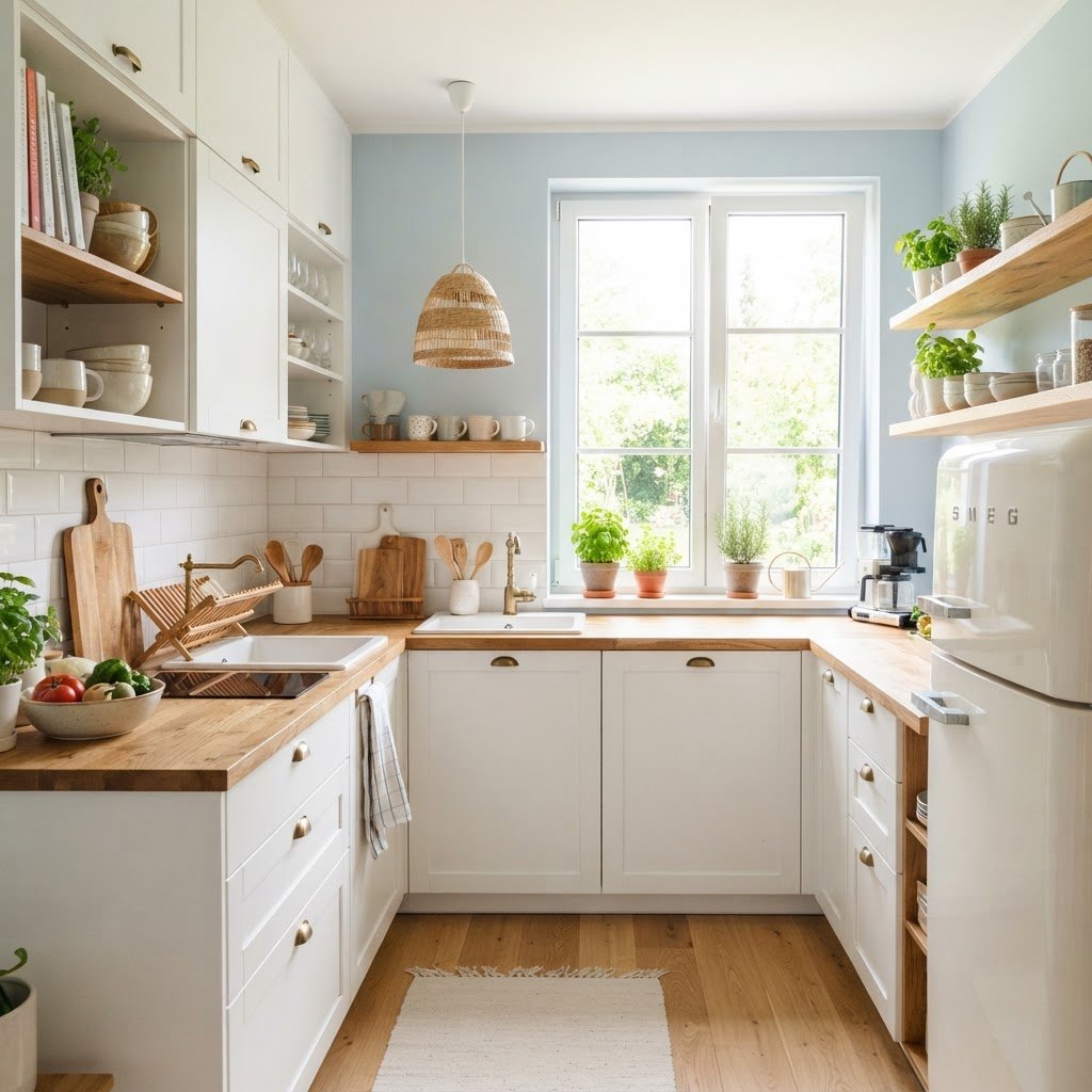
Designing a functional cooking space when you are limited by square footage can feel like a daunting task. However, you can use color psychology tricks that make small kitchens feel bigger and brighter without needing a full-scale renovation. By understanding how light interacts with hues and how our brains perceive depth through color, you can trick the eye into seeing a much more expansive environment. This guide explores the science behind color and how you can apply these principles to your home today. ## The Science of Space and Perception 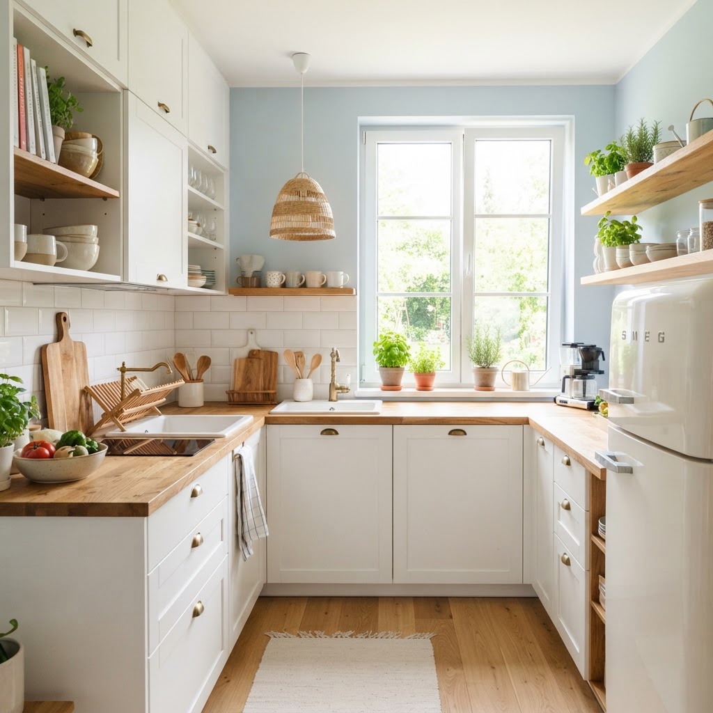 At the core of interior design lies the relationship between light reflection and color. Dark colors absorb light, which can cause a small room to feel claustrophobic and cave-like. Conversely, lighter shades reflect light, bouncing it around the room and creating an airy, open atmosphere. Understanding this simple physics-based principle is the foundation for visual expansion. Beyond simple reflection, color psychology impacts how we feel in a space. Light blues and soft greens are known to have a calming effect, while crisp whites feel clean and clinical. When you use these colors in a small kitchen, you aren’t just changing the decor; you are influencing the user experience. You can also maximize storage in a small apartment kitchen to help minimize the visual weight of cabinets and appliances, making the room feel like it has more “breathing room.”
  ## The Power of Monochromatic Schemes
 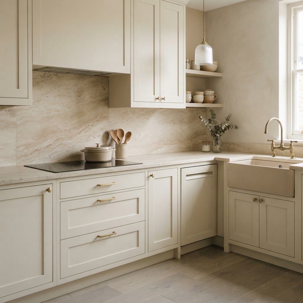 One of the most effective color psychology tricks for tight spaces is the use of a monochromatic color scheme. By painting your walls, cabinets, and even trims in variations of the same color, you eliminate the visual boundaries that usually chop up a room. When the eye doesn’t have to pause at contrasting lines, it perceives the space as a continuous, uninterrupted surface. ### Achieving the Seamless Look To make this work effectively, you need to play with texture and tone rather than distinct colors. Start with a light base, such as soft pearl or antique white. Use a flat finish for walls and a satin or semi-gloss finish for your cabinetry. This slight difference in sheen adds depth without creating the harsh contrast that makes small kitchens feel segmented and cramped. ## Strategic Use of Cool Tones
 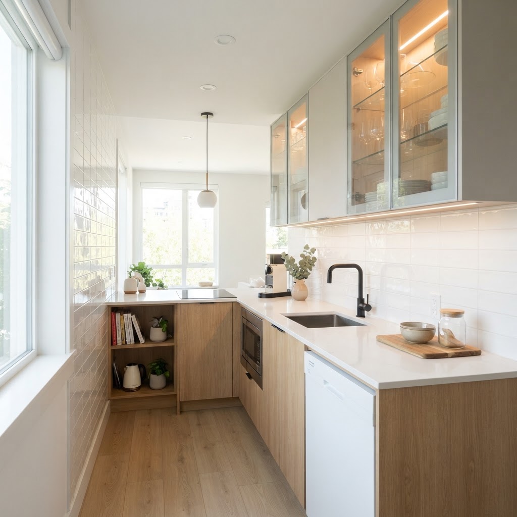 Cool colors, such as light blues, teals, and soft grays, have a unique property: they appear to recede away from the viewer. While warm colors like red or orange seem to advance toward you, cool tones create an optical illusion of depth. This makes them perfect for small kitchens where you want the walls to feel further away than they actually are. Consider using a pale, icy blue on your walls. This color is associated with the sky and water, which naturally evokes feelings of openness and peace. When paired with bright, reflective hardware, the kitchen instantly feels more expansive. Avoid heavily saturated cool tones, however, as too much intensity can have the opposite effect by overwhelming the senses. ## Creating Focal Points with Accents
 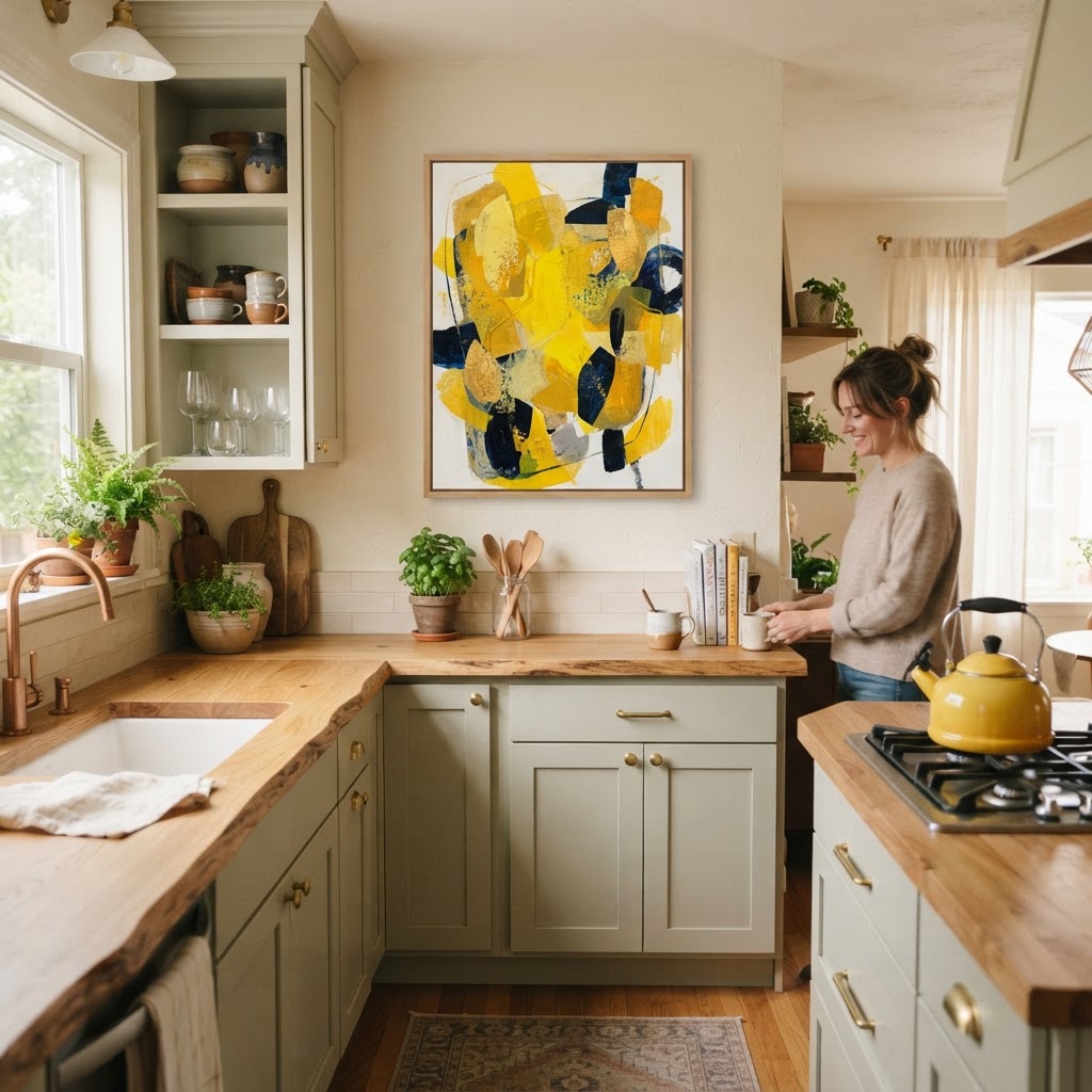 Just because you want a kitchen to feel big doesn’t mean you have to avoid color entirely. A completely stark space can feel uninspired and cold. The trick is to use “pop” colors strategically to draw the eye to specific areas, creating a focal point that distracts from the actual lack of floor space.
  #### Where to Place Your Accents Think about adding a single piece of vibrant wall art, a collection of colorful ceramics, or even a brightly painted window frame. By concentrating color in one specific spot, you control the gaze. When the eyes are occupied by a beautiful accent, they pay less attention to the narrow footprint of the room. Keep these accents limited to ensure you don’t clutter the visual field, as too many points of interest will counteract your efforts to make the kitchen feel larger. ## The Role of Reflective Surfaces While color is the hero, reflective surfaces are the sidekick that makes the magic happen. Light colors need something to bounce off of. Incorporating glass cabinet doors, polished stone countertops, or even metallic backsplashes amplifies the effect of your chosen color palette. These materials effectively double the light in your room, making even the smallest corners feel luminous. ### Maximizing Natural Light Always ensure that your light-colored walls are not obstructed by heavy window treatments. If you need privacy, opt for light-filtering roller shades rather than dark, heavy drapes. The more natural light you can invite into the space, the more effective your lighter wall colors will become, as they will capture that sunlight and brighten the entire kitchen. ## Color Zoning for Functionality Even in a tiny kitchen, you can create the feeling of distinct “zones” through color, which adds to the perceived complexity and size of the room. Using a slightly darker shade on the floor and a very light shade on the ceiling tricks the brain into thinking the room is taller and more expansive. This vertical gradient is a powerful tool in any small room design strategy. When zoning, keep the transitions between colors subtle. A sharp break in color can highlight the limits of the room, whereas a soft fade or a deliberate choice of colors that sit next to each other on the color wheel creates a harmonious, flowing transition that keeps the room feeling cohesive and large. ## Common Mistakes to Avoid Many homeowners fall into the trap of thinking that “brightening” means strictly using stark white everywhere. While white is a great tool, too much of it can result in a sterile environment. It is essential to mix in warm textures—like wood grain or woven baskets—to add humanity to the room. Without these elements, a small, all-white kitchen can feel cold and uninviting, which arguably makes it feel smaller because you want to spend less time in it. Another mistake is neglecting the power of lighting fixtures. You can paint a kitchen the perfect shade of sky blue, but if the lighting is yellow or dim, the color will look muddy. Invest in high-CRI (Color Rendering Index) LED bulbs that mimic natural daylight. This will ensure that the color psychology tricks you have implemented remain effective throughout the evening, not just during the peak daylight hours. ## Conclusion Making a small kitchen feel larger is entirely possible when you leverage the right design strategies. By utilizing cool-toned palettes, embracing monochromatic designs, and maximizing the reflection of light, you can turn a cramped galley or corner kitchen into an airy, welcoming hub of the home. Remember, the goal is to create a space that feels intentional and bright, allowing you to focus on the joy of cooking rather than the limitation of the floor plan. Ready to transform your home? Start by picking one of these color psychology tricks today—perhaps a simple paint refresh or a change in your cabinet hardware—and watch how quickly your small kitchen begins to feel like a spacious oasis. For more design inspiration and daily tips, subscribe to our newsletter and join our community of home improvement enthusiasts!
Color Psychology Tricks to Make Small Kitchens Feel Bigger

Leave a Reply